
Searchable Flyouts
Package JPSoftworks.DesktopToolkit.Controls.SearchableFlyouts
Version 0.1.0-preview.1 (preview)
Quick start
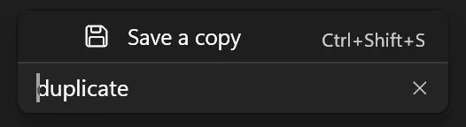
Section titled “Quick start”Add a searchable Document actions menu to an existing WinUI 3 app. Searching for duplicate will find Save a copy through its keyword.
App requirements. Windows 10 version 2004 (build 19041) or later, Windows App SDK 1.8.260317003 or later, and an app targeting .NET 10 or .NET 11. Use the SDK that matches your app’s .NET target.
Install the component on its own
Section titled “Install the component on its own”If your app already has Desktop Toolkit Controls, continue to the example. The steps below install this component from a local preview feed.
Build the package from the toolkit checkout on Windows with the .NET 11 SDK and the repository build prerequisites. From the checkout root, run:
dotnet pack "components/SearchableFlyouts/src/JPSoftworks.DesktopToolkit.Controls.SearchableFlyouts.csproj" ` -c Release -p:Platform=x64 -o artifacts/packagesAdd the checkout’s artifacts/packages directory to your app’s NuGet sources. In Visual Studio, use Tools > NuGet Package Manager > Package Manager Settings > Package Sources. Keep your usual sources enabled for dependencies.
From your app’s project directory, install the exact preview version:
dotnet add package "JPSoftworks.DesktopToolkit.Controls.SearchableFlyouts" ` --version "0.1.0-preview.1"Filter a native menu
Section titled “Filter a native menu”Place this inside the layout of an existing WinUI page or window. Run the app, open Document actions, and type duplicate into the filter. Only Save a copy should remain.
<DropDownButton xmlns:menus="using:JPSoftworks.DesktopToolkit.Controls.SearchableFlyouts" Content="Document actions"> <DropDownButton.Flyout> <menus:SearchableMenuFlyout FilterBoxAutomationName="Find a document action"> <MenuFlyoutItem Text="New document" /> <MenuFlyoutItem Text="Save a copy" menus:SearchableMenuFlyout.Keywords="duplicate"> <MenuFlyoutItem.Icon> <SymbolIcon Symbol="Save" /> </MenuFlyoutItem.Icon> <MenuFlyoutItem.KeyboardAccelerators> <KeyboardAccelerator Key="S" Modifiers="Control,Shift" /> </MenuFlyoutItem.KeyboardAccelerators> </MenuFlyoutItem> <MenuFlyoutItem Text="Print" /> </menus:SearchableMenuFlyout> </DropDownButton.Flyout></DropDownButton>Connect your handlers in the same way as a standard menu. See Native commands for a Click example.
Reference
Section titled “Reference”Searchable flyouts for C# WinUI 3 applications targeting .NET 10 LTS or .NET 11.
The package includes one DLL and one set of compiled XAML per .NET version, both built for Windows SDK 19041.
Both targets require Windows 10 version 2004 (build 19041) or later.
The minimum WinUI package is Microsoft.WindowsAppSDK.WinUI 1.8.260224000, included in Windows App SDK 1.8.260317003.
Command menus use acrylic by default. SearchableDropDown uses a solid WinUI theme fill by default
and supports acrylic through UseAcrylicBackdrop="True".
Requirements
Section titled “Requirements”Use the .NET SDK appropriate for your application’s target framework. A .NET 10 app can consume this package using the .NET 10 SDK; SDK 10.0.404 was verified with WinUI 1.8, Native AOT, trimming, and a cold restore. A .NET 11 app requires a .NET 11 SDK. Both package targets support Windows build 19041 or later and Windows App SDK 1.8.260317003 or later, with the minimum WinUI package version listed above.
The .NET 11 SDK requirement in the repository build instructions applies to building the library and development solution from source. It is not an additional SDK requirement for .NET 10 applications using the NuGet package. The package selects the required Windows SDK projection automatically; no app-side projection override is required.
People running your finished application do not need a .NET SDK. Runtime prerequisites depend on how you deploy the host application. Self-contained deployment includes the .NET runtime; framework-dependent deployment requires the matching runtime. Windows App SDK initialization and deployment remain the host application’s responsibility.
Installation
Section titled “Installation”Add the local package feed to your NuGet sources and reference the package from your WinUI app.
<PackageReference Include="JPSoftworks.DesktopToolkit.Controls.SearchableFlyouts" Version="0.1.0-preview.1" />Controls
Section titled “Controls”SearchableMenuFlyoutadds a filter to nativeMenuFlyoutitems and preserves their handlers.SearchableItemsFlyoutdisplaysSearchableFlyoutItemdata and recycles rows for large lists.SearchableDropDownlets users filter a list and commit a single selection.
Import using:JPSoftworks.DesktopToolkit.Controls.SearchableFlyouts in XAML. The host app provides WinUI initialization and XamlControlsResources.
Native commands
Section titled “Native commands”<Button Content="Actions" xmlns:menus="using:JPSoftworks.DesktopToolkit.Controls.SearchableFlyouts"> <Button.Flyout> <menus:SearchableMenuFlyout FilterBoxAutomationName="Find an action"> <MenuFlyoutItem Text="Save" Click="OnSave" /> <ToggleMenuFlyoutItem Text="Favorite" /> </menus:SearchableMenuFlyout> </Button.Flyout></Button>Large collections
Section titled “Large collections”<menus:SearchableItemsFlyout xmlns:menus="using:JPSoftworks.DesktopToolkit.Controls.SearchableFlyouts" ItemsSource="{x:Bind ViewModel.Commands, Mode=OneWay}" />Populate Commands with SearchableFlyoutItem objects. Use ICommand or ItemInvoked for execution. KeyboardAcceleratorText is a display hint; the host registers shortcuts for virtualized commands.
Single selection
Section titled “Single selection”<menus:SearchableDropDown xmlns:menus="using:JPSoftworks.DesktopToolkit.Controls.SearchableFlyouts" xmlns:models="using:MyApp.Models" ItemsSource="{x:Bind ViewModel.Projects}" SelectedItem="{x:Bind ViewModel.SelectedProject, Mode=TwoWay}" PlaceholderText="Choose a project" FilterPlaceholderText="Filter projects"> <menus:SearchableDropDown.ItemTemplate> <DataTemplate x:DataType="models:Project"> <StackPanel> <TextBlock Text="{x:Bind Name}" /> <TextBlock Text="{x:Bind Folder}" Style="{StaticResource CaptionTextBlockStyle}" /> </StackPanel> </DataTemplate> </menus:SearchableDropDown.ItemTemplate></menus:SearchableDropDown>ItemTemplate receives each original project in the open list. Set ItemTextSelector to
item => ((Project)item).Name to use its name for filtering, the closed selection, and the default automation name.
SelectionChanged uses WinUI’s SelectionChangedEventArgs. AddedItems and RemovedItems contain the original choices.
For commands, SearchableItemsFlyout raises ItemInvoked with the original model in InvokedItem.
Accessibility and localization
Section titled “Accessibility and localization”Give each menu trigger and dropdown a meaningful AutomationProperties.Name or LabeledBy. SearchableFlyoutItem accepts AutomationName, AutomationHelpText, and AutomationId. Search updates expose current status and send coalesced automation notifications without moving focus. Arrow keys move between search and results; typing while a result is focused returns to search.
FilterBoxAutomationName, FilterPlaceholderText, and NoResultsText customize the filter. The dropdown’s PlaceholderText labels an empty selection. Assign a SearchableFlyoutStrings instance from your application’s localized resources to translate result messages, list names, submenu labels, and keyboard help. Strings is immutable; assign a new instance to change language. Its format strings use the current culture and standard .NET format placeholders.
Contracts and limits
Section titled “Contracts and limits”Use the controls and mutate item collections on the UI thread. Filtering scans in-memory data. The virtualized demo exercises 10,008 commands and 10,000 choices; no remote paging is provided. The library supports trimming and Native AOT through generated WinRT bindings and targeted projection metadata. No TrimmerRootAssembly entry or application-level linker descriptor is required for these controls. The native path does not virtualize. It temporarily inserts MenuSearchItem containers into Items while open. Populate or rebuild native items in the Opening event or while the flyout is closed. Exclude the helper rows when inspecting Items during display. Base custom presenter styles on the supplied MenuFlyoutPresenterStyle to retain its search field and scrolling behavior.
Trimming and Native AOT
Section titled “Trimming and Native AOT”Enable PublishTrimmed or PublishAot in the host. AllowUnsafeBlocks is needed for generated WinRT bindings. Keep custom WinRT-derived classes and WinRT interface implementations partial so CsWinRT can generate their bindings. Use x:Bind and typed selectors for application data; the controls do not use reflection to discover properties.
<PropertyGroup> <PublishAot>true</PublishAot> <PublishTrimmed>true</PublishTrimmed> <AllowUnsafeBlocks>true</AllowUnsafeBlocks> <CsWinRTAotWarningLevel>3</CsWinRTAotWarningLevel></PropertyGroup>The component includes scripts/Test-Package.ps1 to pack the library and publish a separate consumer
with all warnings treated as errors. It tests the NuGet integration without a project reference.
Run it with -Flavor Aot or -Flavor Trimmed, then exercise the published app with the UI scripts.
The default consumer targets .NET 10 x64 with Windows App SDK 2.6.5. Use TargetFramework, WindowsAppSdkVersion, and Architecture to test other combinations.
For .NET 10, NuGet uses your app’s Windows target to select a projection from the package manifest.
The manifest is generated from the packing SDK’s stable .NET 10 projections at revision 87 or later,
which contain the IL2081 fix for trimmed JIT apps. Newer SDK defaults and explicit app settings take precedence.
Pass -PackagePath to validate an existing release candidate. For an unpackaged app, check that its published directory
includes its own generated .pri file so WinUI can load the application’s theme resources.
Affected Windows App SDK versions need the unpackaged publish workaround.
Release status
Section titled “Release status”This is a local preview, not an accessibility certification or a stable API promise. The first public NuGet release is pending review. The repository uses per-component release tags and NuGet trusted publishing. Narrator, actual High Contrast themes, large Windows text, and ARM64 execution remain separate release checks.